Work
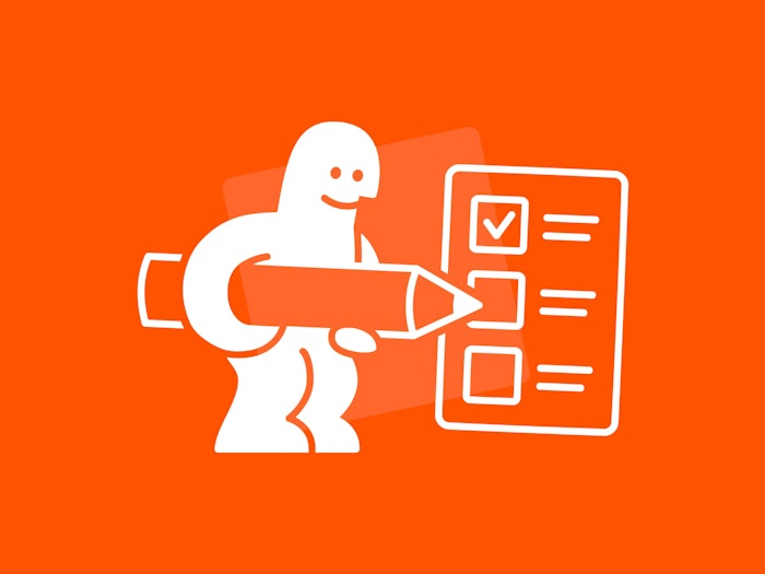
The website for Go Short, an international short film festival, was a total revamp. While I worked at Studio Airport as an interaction designer, we were asked to design and build a modern and refreshing take on their complex festival program.
This new website now provides and easier way for visitors to explore the festival’s yearly extensive line-up and create their own timetable.
In addition to the design of the site, I wrote an article back in 2017 about how to structure such a big amount of data
Every studio or creative team approaches this a little differently and there’s no definitive answer. When it comes to websites like this one, we start out by getting as much information as possible from our client and her stakeholders with a kick–off meeting. In these meetings we discuss everything; from target groups to structuring the website. It’s basically a short but efficient sprint in which we find a basic structure for the website, in direct collaboration with the client and stakeholders.
After that, the team structures all the information more thoroughly by forming a sitemap. A sitemap is an overview of all the pages and possible actions. It forms a base from which we explore and experiment with information architecture and the wireframing of information and interactions. By that the sitemap changes every so often, as we discover better ways to structure information.
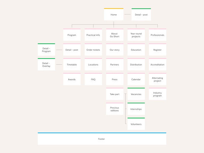
A start for the sitemap of goshort.nl. Was this the best way? We’ll figure it out later on when running into difficulties.
The same goes for the wireframes. You can see it as a dynamic part of the design process in which many iterations follow each other up to improve past ways of structuring information and interactions.
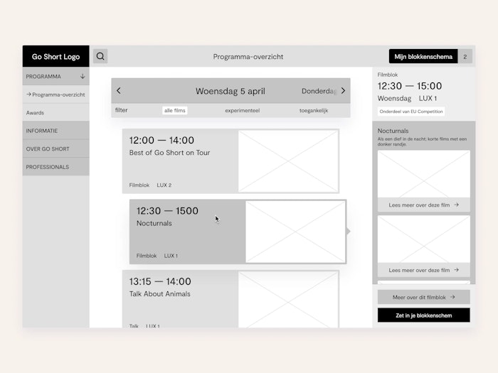
The main way of navigation could be a visual list of film blocks. Click on a film block to open a side panel that displays the films part of that block.
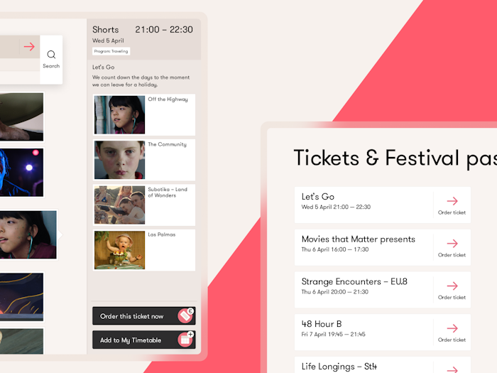
A personalised time table showing recurring patterns like that film block side panel.
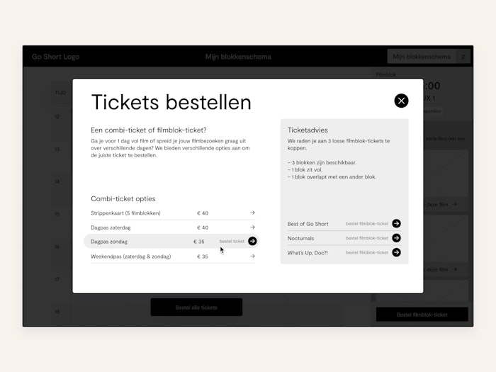
Could buying tickets could be based on your personal time table?
How would you structure those 264 films?
So yeah, that’s a slightly different story. Since the start of the festival, Go Short structures their films in blocks. A block contains 2-5 films. As a visitor, you can only visit a film block, not a single film. Kinda makes sense, as all films have a short run time. It’s more convenient to view a collection of them categorised per theme then to walk into one and missing a bunch of others. Besides film blocks, Go Short also organises parties, lectures and competitions during the festival.
As a festival visitor, you probably want to find a film block you like, select that block and make sure you’re able to visit that block.
Find a film block, select that block, make sure you’re able to visit that block. Easy, right?
Go Short provided a traditional timetable on their previous website in the form of a timetable which showed all the film blocks on all the festival days. Seems like a proper way to visualise an overview, as it feels familiar to the print variant most visitors will use during the festival.
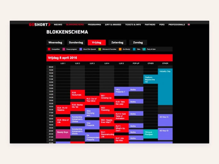
Their previous time table. Traditional isn’t bad, but it doesn’t always allow the most of room for a user to achieve their goals.
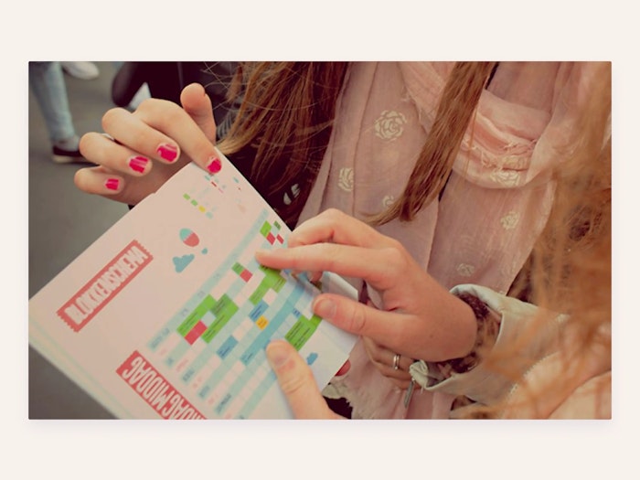
A printed timetable for a festival: bring a pen and circle every act you want to see. It’s fine. For print.
Show me the money; What did you come up with?
As mentioned before, we wanted the visitor to discover & collect film blocks and be able to buy tickets for their selection. So we came up with a combination of both:
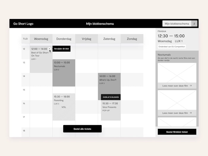
Shopping cart + traditional timetable = create your own timetable.
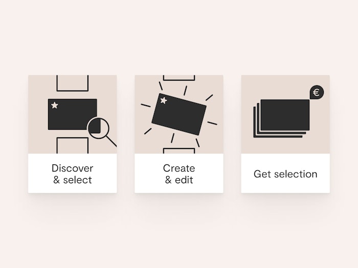
In a few steps, the visitor is able to:
– Discover what Go Short’s festival line-up looks like;
– Select what kind of blocks they wants to see;
– Work out a personal schedule for the weekend;
– Order tickets for that schedule.
So...
So we combined those two interaction models into one! To compare it with the two conceptual models mentioned earlier: people can add film blocks to their shopping cart and create their own timetable. Both are recognisable in the way they behave. The timetable is still a direct visual implementation of the conceptual model, but it acts in a more personal way. And the shopping cart pattern is still there, but is directly connected to the timetable. In a visual schematic you can summarise the user flow like this:
Pretty cool, right?
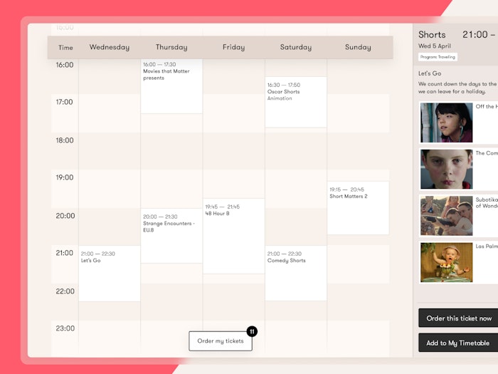
Your own personal time table. Nice.
Wrapping up
A big thanks to Go Short for giving us the opportunity to reinvent the presentation of their online festival line-up. We had a lot of fun thinking up, designing and developing it.
Client
Go Short
Designed while at
Development
Design
Prototyping
Wireframing
Iconography
Visual design
Interaction design
Information structure
Expansion of digital identity
Parta
Currently working on — We make better decisions together.
Restaurant Gys
2022 – All day, err day
Vincent van der Werf
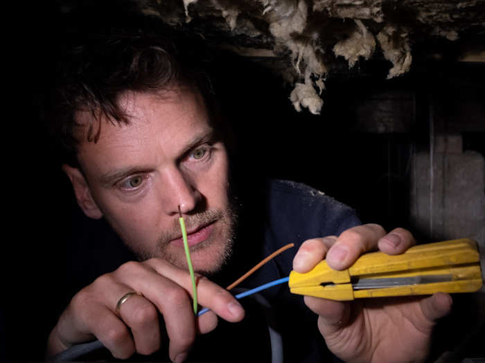
2024 – Everything starts with electricity
Klif
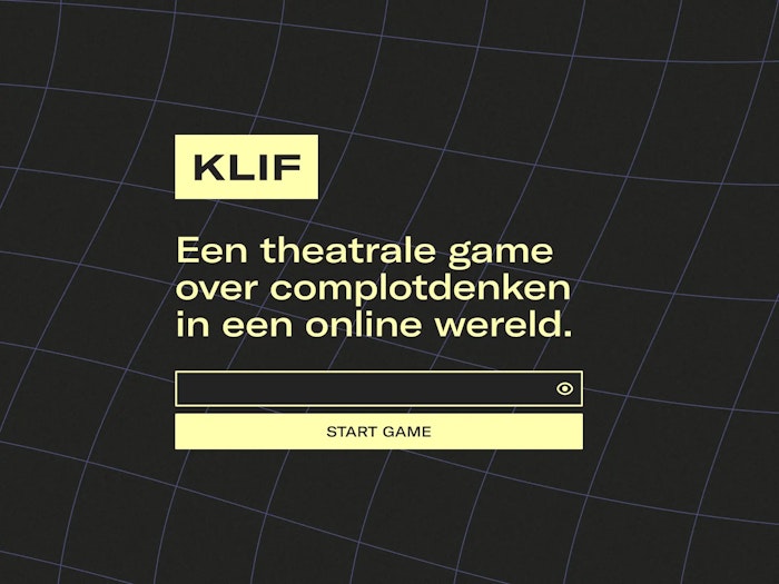
2021 — A serious game about conspiracy thinking and online misinformation.
RUFF
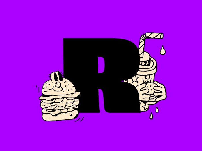
2021 — Vegan Burger Fun, delivered.
Studio Natuurlijk
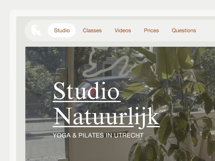
2019 — Take a chill pill. Or follow proper yoga classes. I’d go for the second option.
Go Short
2017 — Finding structure in a festival line-up comprised of 264 films.
Eurofiber – 2021
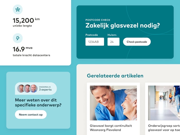
Eurofiber has been a provider of industry-leading digital infrastructure since 2000. Together with the crew at iO, I redesigned their site.
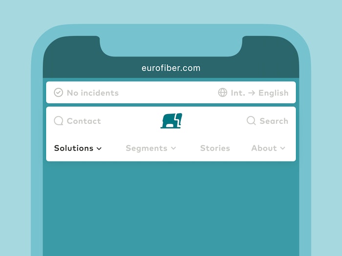
Eurofiber has many products, which I wanted to present elegantly. No hamburger buttons. Through the new mobile menu, users are able to quickly orient around their many offerings.
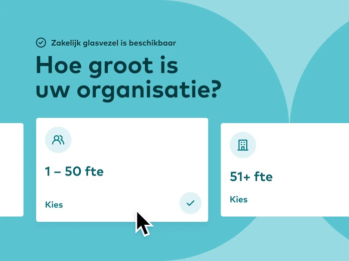
I see you looking at that cursor, thinking, "it can't be that big, right?". And you're correct about that. It's fake. But the funnel supporting different sized organisations isn't.
Kapitaal — 2020
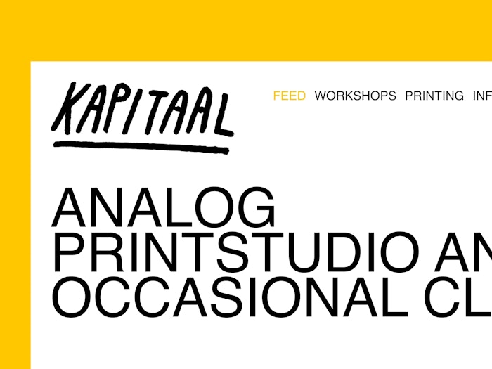
They said Helvetica, black and white. We gave them Helvetica, black and white.
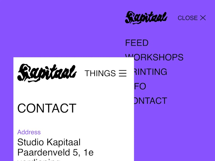
Through information architecture, we kept the navigation structure simple as pie. Or hamburger, in this case. Sorry, designer jokes.
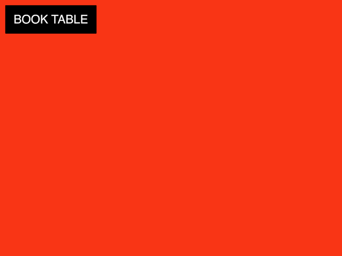
Scrolling through pages that contain buttons makes labels act funny. Because, why not be a bit forceful about booking a screen printing table?
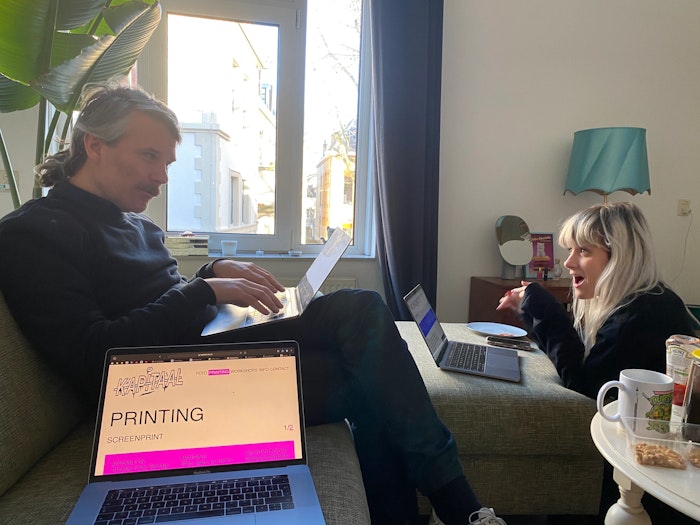
It is always fun to pretend to work with Ramon & Carlien.
Project with Carlien Peijsel & Ramon Goedvree. Development by Rik Frieling.
No Seat at the table — 2020
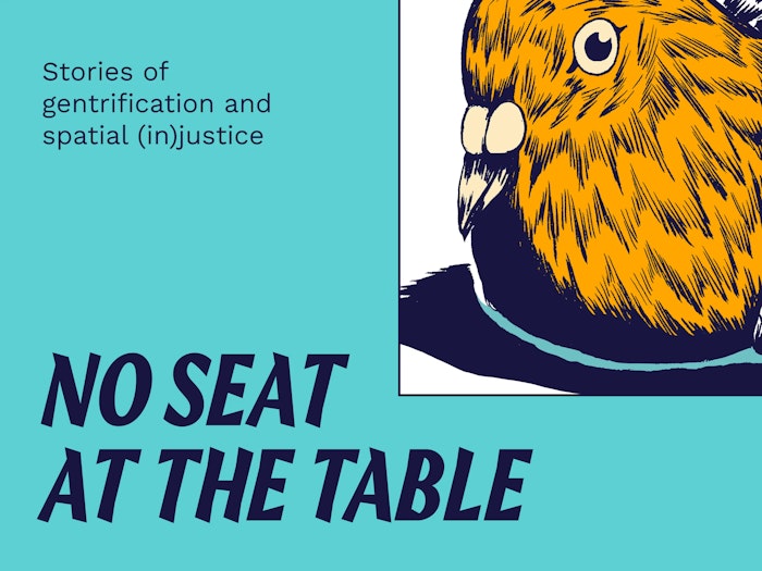
No Seat at the Table is an online platform to exchange stories of gentrification, the housing crisis and the need for spatial justice.
The original bird illustration is created by Rajab Eryigit.
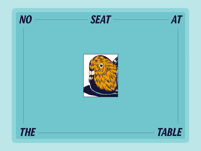
For this site, we created some fancy shmancy intro animations and different ways to discover stories of gentrification.
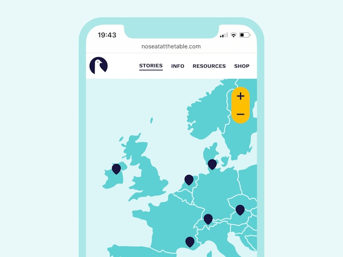
Do you see that? No hamburger menu! On a mobile screen? No way. Just. Wow!
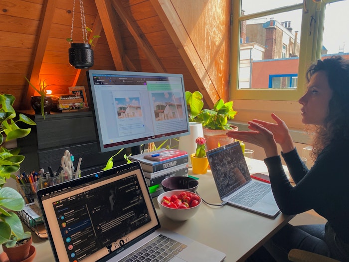
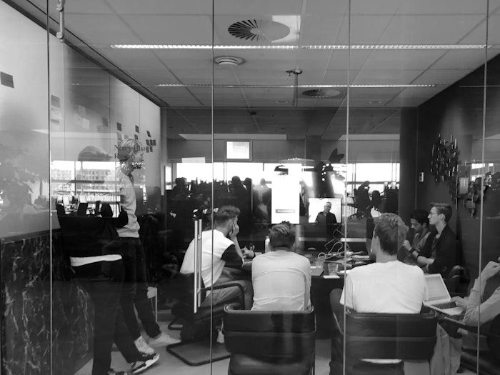
I like to take the time with clients to nail down certain steps in the design process. Minem and I are going through a review here.
Project with Minem Sezgin. Development by Rik Frieling.
Eneco — 2018
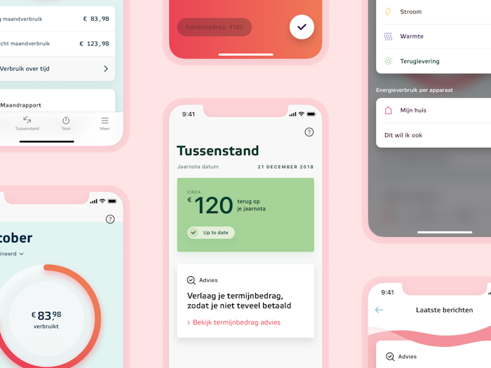
The Eneco app enables consumers to influence their energy bill by offering data on their power usage.
During my time we utilised click data, interviews and surveys to simplify the interface and user flows. We improved the menu through a card sort.
By following the Jobs to be Done model, we focused most of the redesigned interactions around the goals users have.
We also realised a bigger shake-up of the app through a design sprint.
Project with Dept & Eneco.
HR Projectadvies — 2018
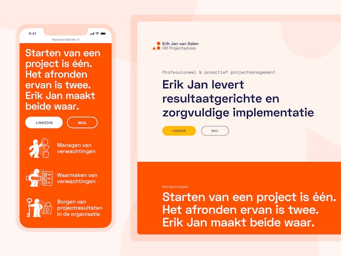
As an interim project manager Erik Jan helps large corporates go through organizational changes. The renewed site expresses who he is: an expert with an approach that connects people.
We rewrote and restructured Erik Jan's previous website using a priority guide. We also used the guide to build wireframes. Not that that's related to this guy.
When in doubt, add more illustrations. In this case, we created some abstract ones related to typical HR practices and skills.
I couldn't find a photo of Nick and me working on this project, so here's a photo of Nick in Voorlinden.
Project with Erik Jan van Dalen. Design & development with Nick Lutgerhorst.
Info


I'm Martijn, a digital designer from Utrecht (NL).
While I focus on tinkering with interfaces and designing for curiosity, I appreciate being involved in branding as well.
I like to think about friction in interaction design.
Technology is an instrument meant to help us, which means it shouldn’t intrude when we don’t need it. By thoughtfully adding small amounts of friction to well-considered places, I believe that we can strike the right balance between maximising usability and maintaining an appropriate distance.
Another way I’d like to look at design is that it is a way of making the technology we use feel considerate, warm and natural. While this isn’t technology’s default state, I believe that we should use design to give us back some of that warmth.
This means we should be focused on anticipating and solving a user’s problems before they ever have them. Ideally, a tool should be so intuitive and caring that we forget that it’s technology at all. It should just be there when it’s needed, and absent when it’s not.
Currently
Digital product designer at Parta – a method & platform for decision-making processes
Freelance designer – helping out friends, design studios and organisations
Guest lecturer at Utrecht University of Applied Sciences – Communication and Media Design
Previously
Lecturer at Utrecht University of Applied Sciences – Communication and Media Design's specialisation 'Human Centered Design'
Digital designer at iO
UX designer at Hike One
UX designer through secondment at SchaalX
Designer at Studio Airport
Collaboration is essential to create relevant work. In my freelance practice, I experiment with different approaches of collaboration, be it with clients, specialists in related fields and designers new to the game.
I’ve developed a strong interest in socially driven projects by being involved in ones such as restaurant Syr and Parta. It's also why I started lecturing at Communication & Multimedia Design in Utrecht. Are you working on a socially driven project? I’m always open to learn more. ☻
Some clients I worked for
University of the Arts Utrecht
Dutch Ministry of Culture, Education and Science
Into the Great Wide Open
Amsterdam Art Council
Sportbedrijf Rotterdam
Emergence Magazine
White Ribbon UK
Restaurant Syr
Zware Jongens
Greenpeace
Kapitaal
Pfizer
eBay
Main skills
Interaction design
Digital branding
Visual design
Also fine at
Concept development
Project management
Design education
Usability testing
Design Thinking
Design systems
Workshopping
User research
Iconography
Prototyping
UX writing
Kanban
Scrum
Agile
GTD
I play around in
Final Cut Pro X
Affinity’s suite
Adobe’s suite
Keynote
Framer
Sketch
Things
Notion
Figma
Miro
Jira
Office (with a face like this: 😤)
Mentions
It's Nice That – Tom Heerschop
Commarts – Tom Heerschop
Volkskrant – Syr
DUIC – Syr
NU – Syr
European Design Award – Amsterdamse Kunstraad
Honorable Mention – Amsterdamse Kunstraad
Honorable Mention – Tom Heerschop
Honorable Mention – Go Short
Honorable Mention – Inspire
DesignRush – Ruff
For inquiries
If you’re into PDFs
Development by
Eurico Sá Fernandes and Jori Regter
Shout out to
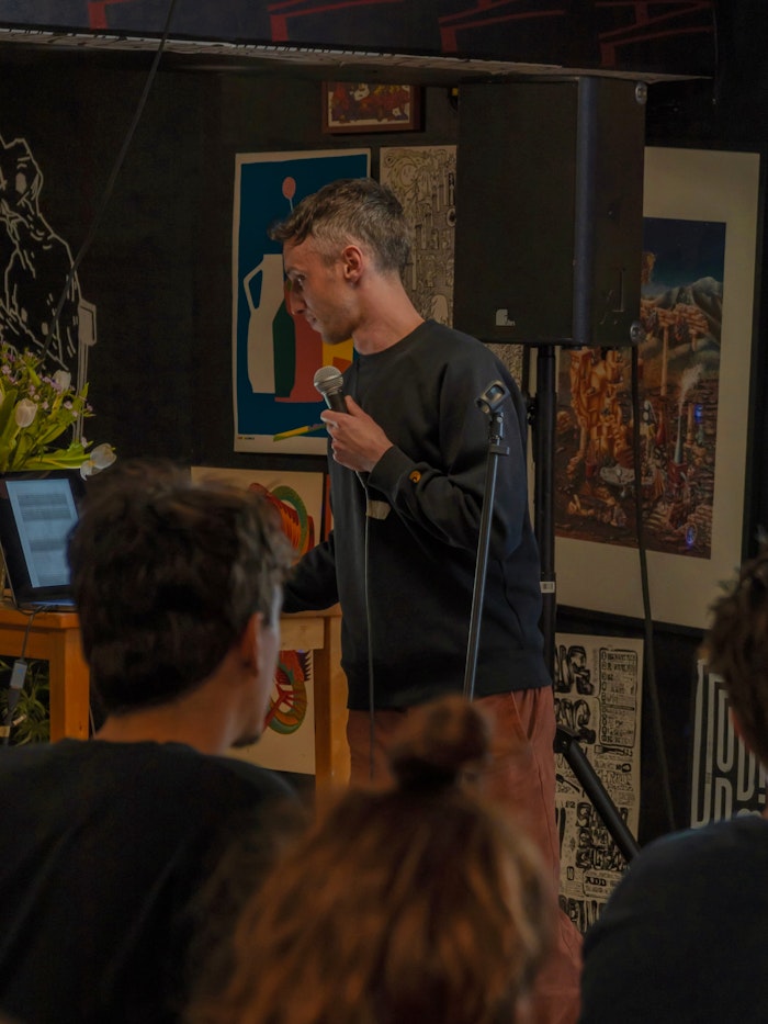
Nikita Kuijpers for photographing me during my talk, my friends for the other photos, and my mentors, fellow designers, technologists and thinkers at large — past and present — who continue to shape how I work.
- A designer
- doing sites,
- apps & such