Work
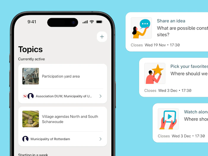
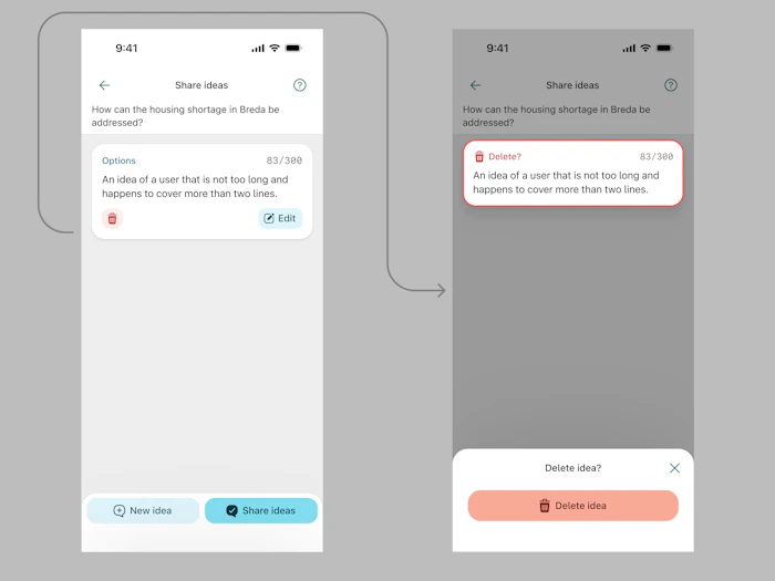
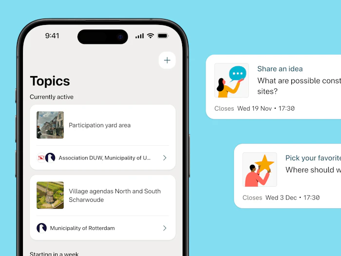
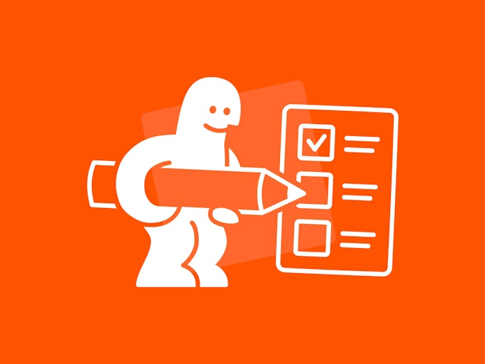
As a collective, we are able to find outcomes and solutions together. Parta facilitates informed, focused decision making to support and broaden democratic processes. It allows everyone to contribute to ideas and decisions on various topics.
I redesigned the apps over the summer in 2020 and joined the team as their first designer later that same year. We're currently iterating on the platforms through learnings of usage by organisations and participants alike.
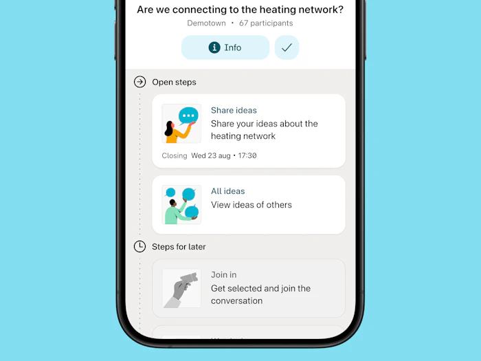
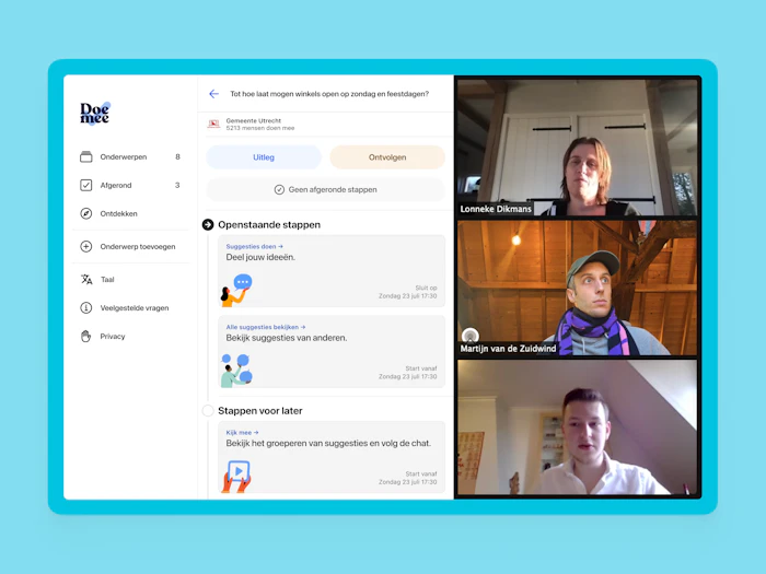
By using a timeline as an interface concept, participants are able to monitor and interact with decision-making processes.
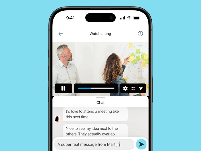
Every step in the timeline provides a way to participate and work towards a decision that has buy-in of participants by providing transparency and agency. In this case, participants can either partake in the grouping of ideas or watch along through live video and react in the chat.
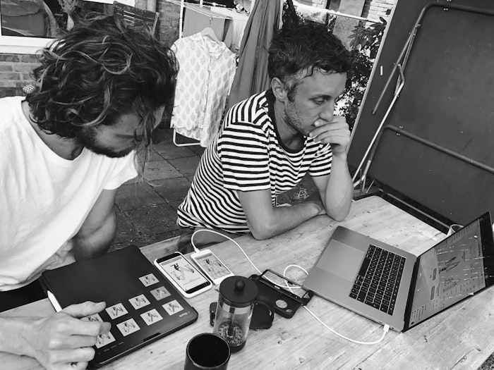
Together with the devs, I created a component library with which we're setting up a design system in the future (prioritise your baby steps, y'all). With that library we can quickly review every scenario and user flow we can come up with.
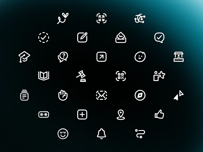
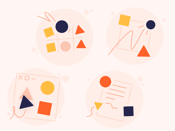
And look at that. Even more icons. We use these (and many more) to connect sometimes abstract concepts to conceptual models people may have about other digital or real life spaces. Think voting, collaborating, complexities, etcetera. My favourite is definitely 'provide us feedback'. If you can find it, you win a prize.
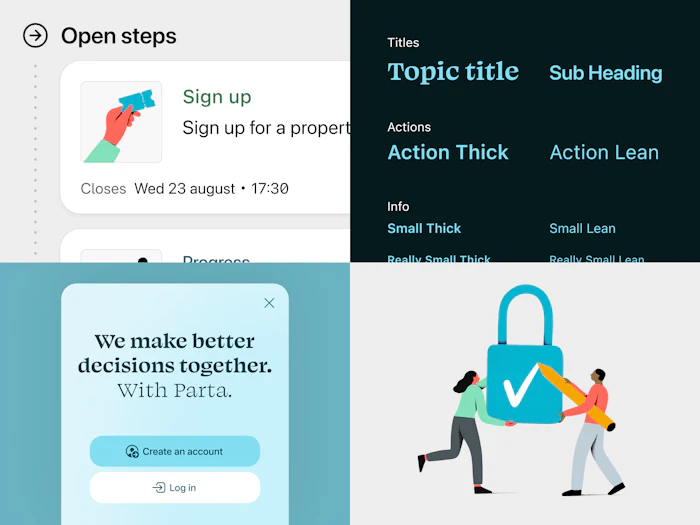
Mandatory design system image! Some cards, some typography styles, even some icons in dark blue blobs on the right.
We like to know stuff for sure. Usability testing helps with that. Founder Lonneke and I tested multiple hypotheses within our first design implementation.
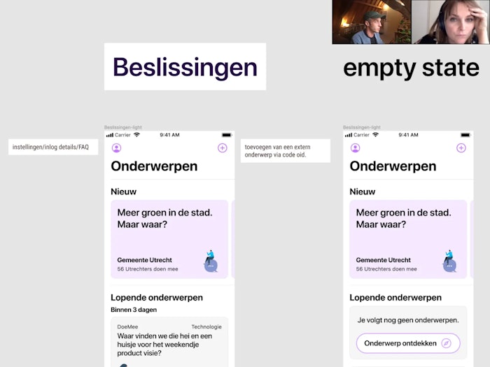
Together with interaction designer Nikki Buitendijk, I improved the connection between the interfaces and the mental models they're based on. This is a very early setup of the design.
Sjoerd van Leeuwen created some nifty illustrations and pictograms. Since we want to reach citizens from all walks of life, it's crucial to have the entry level be as low as it can possibly be. Visual recognition through imagery can help with that. We spent the hottest day of the year optimising colours and scannability.
Core team
Mathijs Kemp
Lonneke Dikmans
Maaike van der Gaag
Lucien van der Plaats
Ronald van Luttikhuizen
Martijn van de Zuidwind
Development
Web app + native apps all done by the team at Vennster
Design
Prototyping
Iconography
Accessibility
Visual design
Design system
Expansion of identity
Digital strategy consultation
Interaction concepts & design
Content
UX writing
Social media assets
Strategy
UX strategy
Usability testing
Information structure
Illustrations
Logo design
Extra shout out
Tom Kölker for the naming workshop
Jimme Bakker for the identity explorations
Nikki Buitendijk for the very early interaction design sessions
Links
Parta
Currently working on — We make better decisions together.
Restaurant Gys
2022 – All day, err day
Vincent van der Werf
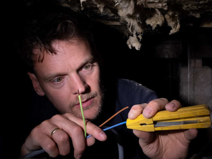
2024 – Everything starts with electricity
Klif
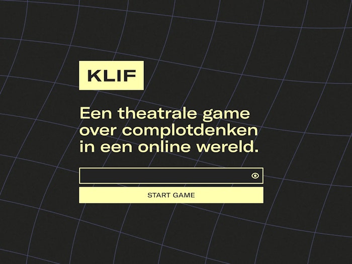
2021 — A serious game about conspiracy thinking and online misinformation.
RUFF
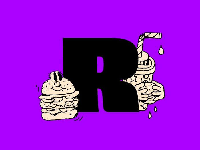
2021 — Vegan Burger Fun, delivered.
Studio Natuurlijk
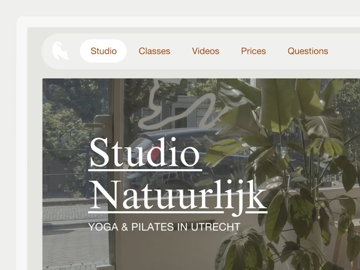
2019 — Take a chill pill. Or follow proper yoga classes. I’d go for the second option.
Go Short
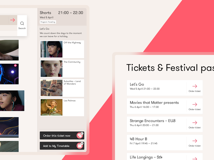
2017 — Finding structure in a festival line-up comprised of 264 films.
Eurofiber – 2021
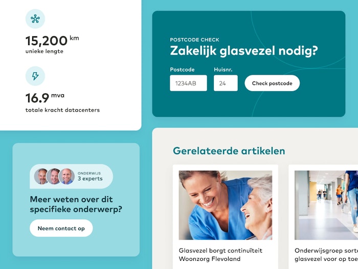
Eurofiber has been a provider of industry-leading digital infrastructure since 2000. Together with the crew at iO, I redesigned their site.
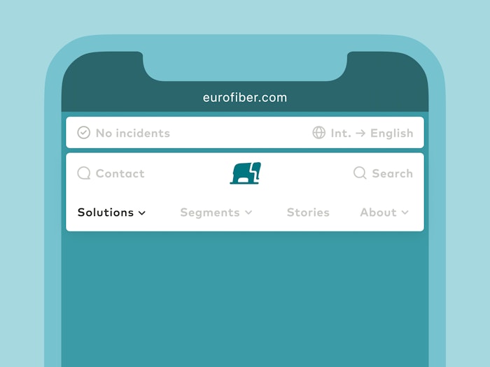
Eurofiber has many products, which I wanted to present elegantly. No hamburger buttons. Through the new mobile menu, users are able to quickly orient around their many offerings.
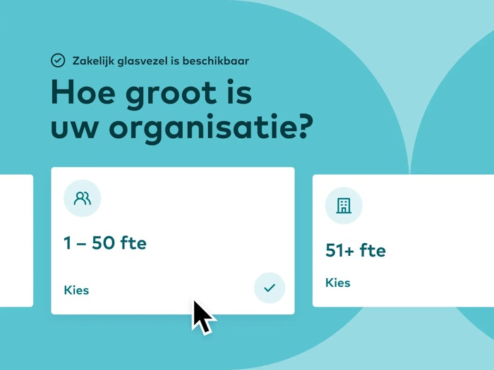
I see you looking at that cursor, thinking, "it can't be that big, right?". And you're correct about that. It's fake. But the funnel supporting different sized organisations isn't.
Kapitaal — 2020
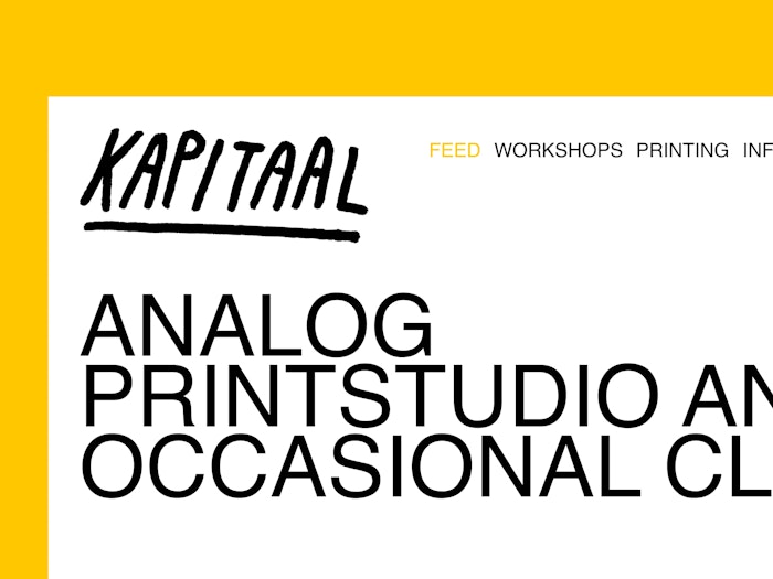
They said Helvetica, black and white. We gave them Helvetica, black and white.
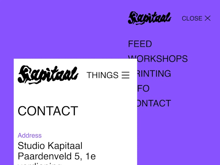
Through information architecture, we kept the navigation structure simple as pie. Or hamburger, in this case. Sorry, designer jokes.
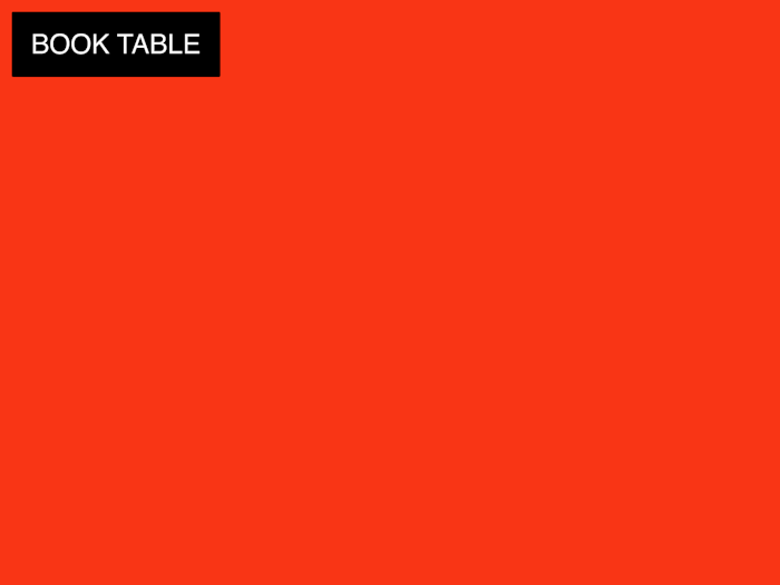
Scrolling through pages that contain buttons makes labels act funny. Because, why not be a bit forceful about booking a screen printing table?
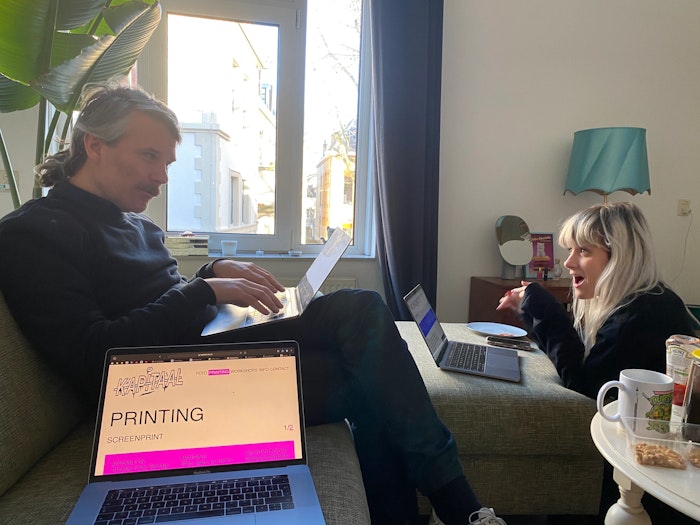
It is always fun to pretend to work with Ramon & Carlien.
Project with Carlien Peijsel & Ramon Goedvree. Development by Rik Frieling.
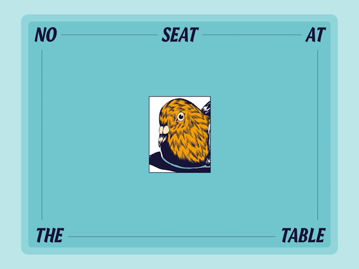
No Seat at the table — 2020
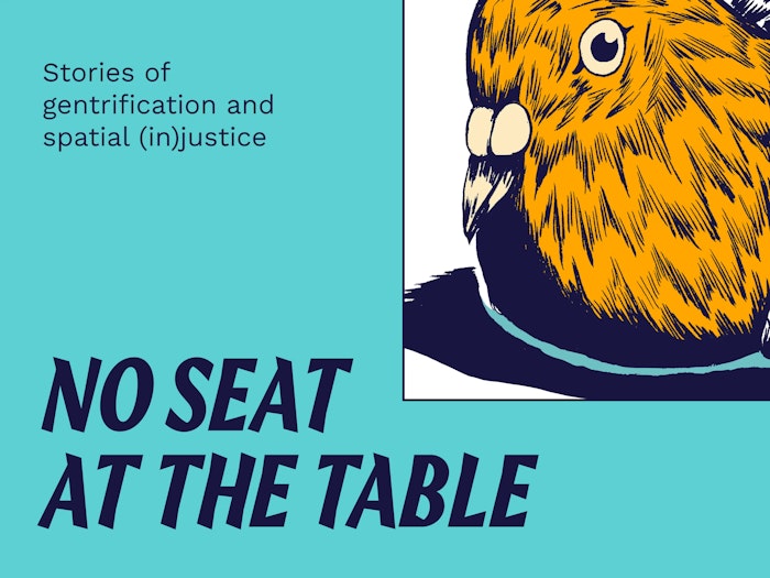
No Seat at the Table is an online platform to exchange stories of gentrification, the housing crisis and the need for spatial justice.
The original bird illustration is created by Rajab Eryigit.
For this site, we created some fancy shmancy intro animations and different ways to discover stories of gentrification.
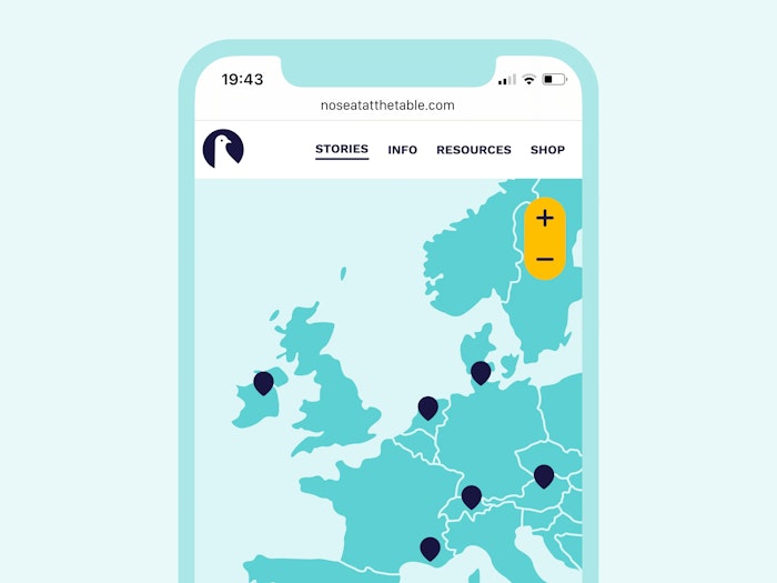
Do you see that? No hamburger menu! On a mobile screen? No way. Just. Wow!
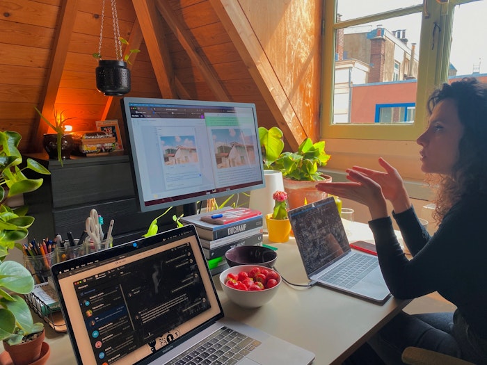
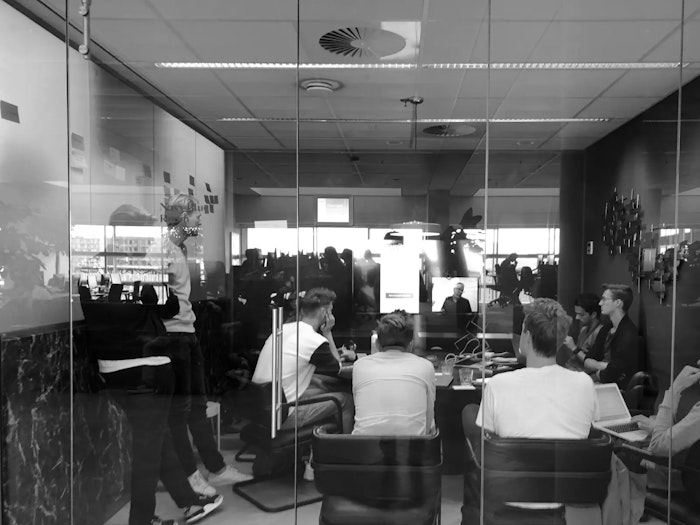
I like to take the time with clients to nail down certain steps in the design process. Minem and I are going through a review here.
Project with Minem Sezgin. Development by Rik Frieling.
Eneco — 2018
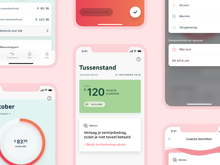
The Eneco app enables consumers to influence their energy bill by offering data on their power usage.
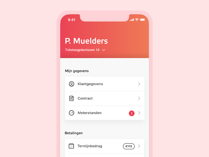
During my time we utilised click data, interviews and surveys to simplify the interface and user flows. We improved the menu through a card sort.
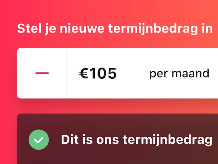
By following the Jobs to be Done model, we focused most of the redesigned interactions around the goals users have.
We also realised a bigger shake-up of the app through a design sprint.
Project with Dept & Eneco.
HR Projectadvies — 2018
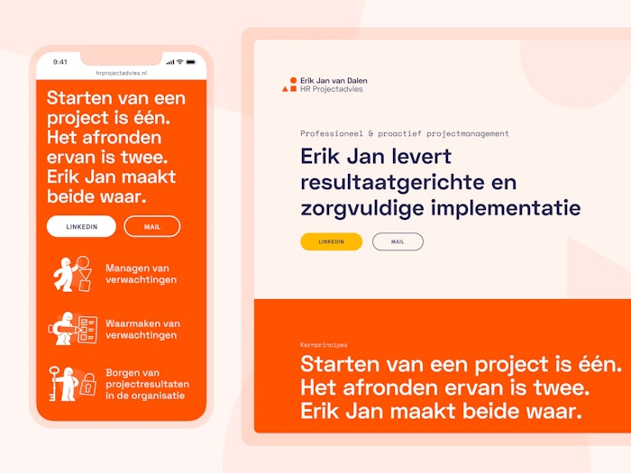
As an interim project manager Erik Jan helps large corporates go through organizational changes. The renewed site expresses who he is: an expert with an approach that connects people.
We rewrote and restructured Erik Jan's previous website using a priority guide. We also used the guide to build wireframes. Not that that's related to this guy.
When in doubt, add more illustrations. In this case, we created some abstract ones related to typical HR practices and skills.
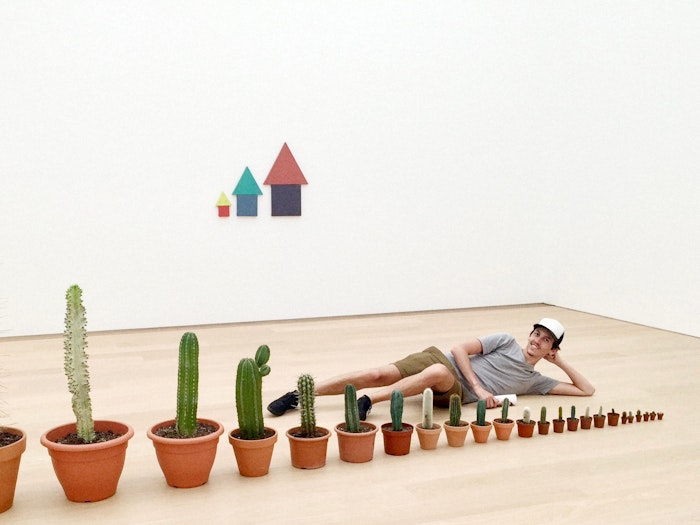
I couldn't find a photo of Nick and me working on this project, so here's a photo of Nick in Voorlinden.
Project with Erik Jan van Dalen. Design & development with Nick Lutgerhorst.
Info


I'm Martijn, a digital designer from Utrecht (NL).
While I focus on tinkering with interfaces and designing for curiosity, I appreciate being involved in branding as well.
I like to think about friction in interaction design.
Technology is an instrument meant to help us, which means it shouldn’t intrude when we don’t need it. By thoughtfully adding small amounts of friction to well-considered places, I believe that we can strike the right balance between maximising usability and maintaining an appropriate distance.
Another way I’d like to look at design is that it is a way of making the technology we use feel considerate, warm and natural. While this isn’t technology’s default state, I believe that we should use design to give us back some of that warmth.
This means we should be focused on anticipating and solving a user’s problems before they ever have them. Ideally, a tool should be so intuitive and caring that we forget that it’s technology at all. It should just be there when it’s needed, and absent when it’s not.
Currently
Digital product designer at Parta – a method & platform for decision-making processes
Freelance designer – helping out friends, design studios and organisations
Guest lecturer at Utrecht University of Applied Sciences – Communication and Media Design
Previously
Lecturer at Utrecht University of Applied Sciences – Communication and Media Design's specialisation 'Human Centered Design'
Digital designer at iO
UX designer at Hike One
UX designer through secondment at SchaalX
Designer at Studio Airport
Collaboration is essential to create relevant work. In my freelance practice, I experiment with different approaches of collaboration, be it with clients, specialists in related fields and designers new to the game.
I’ve developed a strong interest in socially driven projects by being involved in ones such as restaurant Syr and Parta. It's also why I started lecturing at Communication & Multimedia Design in Utrecht. Are you working on a socially driven project? I’m always open to learn more. ☻
Some clients I worked for
University of the Arts Utrecht
Dutch Ministry of Culture, Education and Science
Into the Great Wide Open
Amsterdam Art Council
Sportbedrijf Rotterdam
Emergence Magazine
White Ribbon UK
Restaurant Syr
Zware Jongens
Greenpeace
Kapitaal
Pfizer
eBay
Main skills
Interaction design
Digital branding
Visual design
Also fine at
Concept development
Project management
Design education
Usability testing
Design Thinking
Design systems
Workshopping
User research
Iconography
Prototyping
UX writing
Kanban
Scrum
Agile
GTD
I play around in
Final Cut Pro X
Affinity’s suite
Adobe’s suite
Keynote
Framer
Sketch
Things
Notion
Figma
Miro
Jira
Office (with a face like this: 😤)
Mentions
It's Nice That – Tom Heerschop
Commarts – Tom Heerschop
Volkskrant – Syr
DUIC – Syr
NU – Syr
European Design Award – Amsterdamse Kunstraad
Honorable Mention – Amsterdamse Kunstraad
Honorable Mention – Tom Heerschop
Honorable Mention – Go Short
Honorable Mention – Inspire
DesignRush – Ruff
For inquiries
If you’re into PDFs
Development by
Eurico Sá Fernandes and Jori Regter
Shout out to
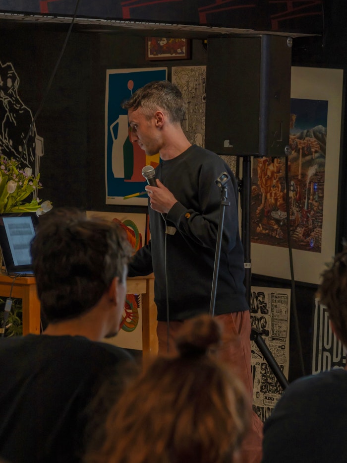
Nikita Kuijpers for photographing me during my talk, my friends for the other photos, and my mentors, fellow designers, technologists and thinkers at large — past and present — who continue to shape how I work.
- A designer
- doing sites,
- apps & such